Insight
Can Figma Make become a design partner
when no designer is in the room?
Every week at Meadow Brooke, we run an AI Lab session. We pick a tool or technology, put it under real working conditions, and report back honestly: the good, the unexpected, and the things that still need work. It’s how we keep our AI literacy ahead of the curve, sharpen our ways of working, and make sure we’re delivering the kind of ideas and solutions that actually work in practice. This week: Figma Make.
The context matters. In product work, great designers transform early research into clear, functional journeys. But on internal tools — think Salesforce, operational dashboards, business-critical platforms — that design expertise is rarely in the room. The assumption is almost always the same:
« It’s for employees, so it doesn’t need polished UX. » We couldn’t disagree more. Internal users are still users — and when we get the UX wrong for them, we slow them down, increase training costs, and erode goodwill that is very hard to recover.
The question we brought to this session was specific: could Figma Make act as a design partner on an operational platform project, when no designer is available?
The stakes were real. A complex internal tool. A tight timeline. No design resource. The perfect test.
The challenge
Why static prototypes aren’t enough
Without a tool like Figma Make, prototypes built in standard Figma are mostly non-interactive. They serve their purpose for documentation, but they consistently fall short in three ways.
Stakeholders struggle to imagine interactions from static screens. Logic gaps slip through that would have been caught in a clickable flow. And there is no real opportunity for user testing — so issues that surface during build could have been caught weeks earlier, at a fraction of the cost.
For Salesforce projects, there is a workaround: leaning on the Salesforce Lightning Design System to speed up UI decisions and focus on UX rather than visual design. But even with that, the prototype is still flat. Flat prototypes document intent. They don’t validate it.

The findings
Three things that genuinely surprised us
01 — First impressions
Intuitive from the first prompt
The interface is disarmingly simple: a prompt panel on the left, a live design canvas on the right. You generate, review, spot what needs improving, and write your next prompt. It is a fluid, feedback-driven loop that feels natural within minutes.
Compared to standard Figma — where building an interactive prototype requires manual linking, component configuration, and a fair amount of patience — Figma Make removes the friction that usually makes prototyping feel like a separate project in itself.
What this means in practice
Product Managers and Business Analysts can now own the prototyping process without needing to hand off to a designer or learn Figma’s full toolset.
02 — Beyond the brief
It challenged our thinking, not just followed it
Figma Make didn’t just execute instructions: it suggested better solutions for some of the trickiest flows. Normally, finding the right component approach in the Salesforce design system requires hours of testing and iteration. In this session, we threw our hardest design challenges at the tool, and its concepts outperformed the original ideas.
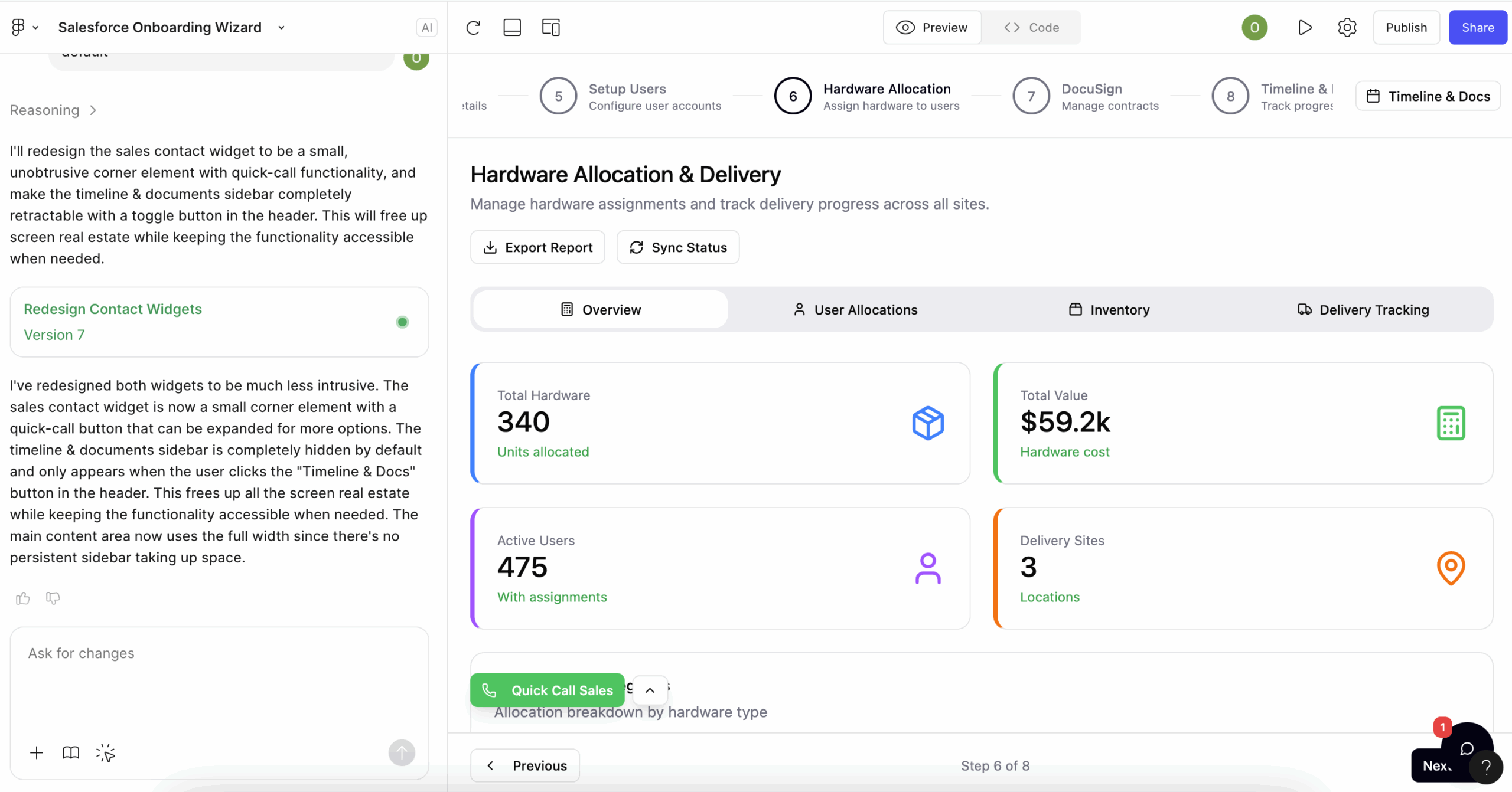
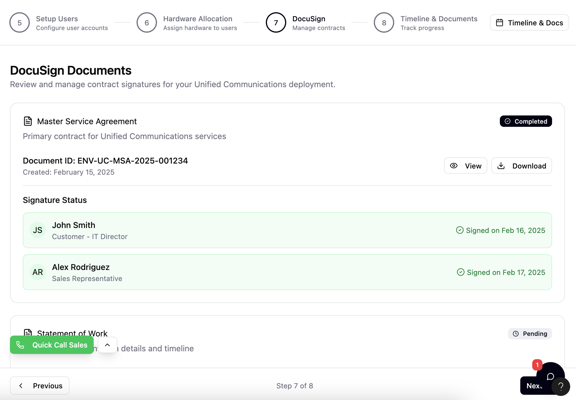
There were also sections of the journey we hadn’t explicitly prompted. When Figma Make recognised a DocuSign-style signing flow, it automatically defined how that section should behave, surfacing the two things users consistently struggle with: understanding document status at a glance, and seeing instantly who still needs to sign. Neither was specified in the prompt. Both were handled correctly.
What this means in practice
Figma Make brings a level of UX pattern recognition that adds genuine value — particularly for flows with established user expectations that an AI can infer from context.
03 — Stakeholder ready
Non-technical audiences engaged immediately
The resulting prototype was polished enough for non-technical stakeholders to click through and understand instantly — without needing facilitation or explanation. That matters. Getting a stakeholder to genuinely engage with a prototype, rather than nod politely at a static slide, is where real feedback lives.
The prototype was also realistic enough to surface logic gaps early — the kind that usually only emerge mid-build, when the cost of fixing them is significantly higher.
What this means in practice
Earlier, higher-quality feedback. Fewer surprises in development. Better outcomes for end users — whether those users are customers or colleagues.
The impact
What changes when prototyping is no longer a bottleneck
The implications extend well beyond convenience. When interactive prototyping becomes accessible to PMs, BAs, and consultants — not just designers — it changes the entire rhythm of a project.
There are limitations worth noting. Design system integration — particularly with the Salesforce Lightning Design System — is the area we would most want to see improved. And like any AI tool, the quality of the output is directly tied to the quality of the prompt. Vague briefs produce vague designs.
Practical guidance
Five prompting principles to get the most from Figma Make
Based on this session, these are the approaches that consistently produced better results — and the ones we will carry into future projects.
How to brief it like a designer
- Start with what you have. Upload your existing wireframes or sketches. The output won’t be identical, but it gives Figma Make a meaningful head start and keeps the design grounded in your actual requirements.
- Be precise in your prompts. Detailed, multi-part instructions consistently produce better results than open-ended ones. Treat each prompt as a design brief, not a search query.
- Include real business rules. Add conditional steps, role-based views, and error handling. The closer the prompt reflects how the live system will behave, the more useful the prototype becomes.
- Ask it to challenge you. Prompts like « here is my current flow — suggest three improvements for usability and accessibility » consistently surfaced ideas we hadn’t considered.
- Prototype for different user types. « Show this flow for a first-time user and a returning user — highlight the differences » is a powerful way to stress-test a journey before development begins.
The broader point stands regardless of the tool: whether you are building for customers or colleagues, good design is never optional. The cost of poor UX on internal platforms is just less visible — until it isn’t.
Work with Meadow Brooke
Putting UX at the centre of your next implementation.
Whether you are planning a Salesforce rollout, an internal platform build, or a broader transformation programme, we can help ensure user experience stays at the heart of the design — not as an afterthought.
Start the conversation
[authorbox]